← All projects

Foodable

Play the ingredients you’ve been dealt.

Date
October 2024
Project
Brand strategy & visual identity
Category
Food & Tech
Sector
AI-native premium consumer app · Recipe app & jollof sauce

A small band of friends fresh out of a London university, with a recipe app, a jar of jollof sauce and a lot of nerve. Their rivals? Recipe giants with millions in the bank, in an app store drowning in AI clones. They had belief and imagination. They needed a brand that looked ready long before they were big. That’s where I came in.

01 / Play the ingredients you’ve been dealt.Explore the full story ↓
The results

What changed.

Shelf-readyUnlocked UK supermarket retail pitches
208Page super-heavyweight brand strategy
1Identity across an app and a food product
50People in custom message testing
The problem

No track record, no famous name, and a software brand about to launch a physical sauce. To win supermarket buyers and stand out among AI recipe apps, Foodable had to look credible from day one.

How I tackled it
  1. Internal discovery workshop with the founders
  2. Internal insights, distilled
  3. Primary and secondary research
  4. Comparative analysis of the market
  5. Super-heavyweight brand strategy
  6. Positive and negative creative direction
  7. Visual and motion direction
  8. Identity: core, then support system
  9. Brand in action: real-world applications
  10. Project presentation
The opening sequence / 02—04

Food, imagination and a little kitchen magic.

The wordmark in a food-led composition.
Illustration / making possibility visible.
A richly detailed identity composition.
Project overview

Play the ingredients you’ve been dealt.

Foodable starts with a practical question: what can I make with the ingredients and equipment I already have? The identity gives that everyday act of resourcefulness a world of its own—part culinary imagination, part cultural celebration.

Client / Brand
Foodable — an ingredient-led recipe app.
Solution
A brand strategy, verbal direction and visual identity centred on resourcefulness, food culture and making more of what you have.
Services
  • Brand strategy & positioning
  • Verbal & visual identity
  • Art direction & illustration direction
  • Brand book & style guide
Credits Gavin Roy Nkalubo +
Brand strategy & creative direction
Gavin Roy Nkalubo
Visual identity & brand guidelines
Gavin Roy Nkalubo
Purpose & creative direction

A little into a lot.
Ordinary into extraordinary.

Foodable’s practical starting point is the kitchen someone already has. The creative direction turns that constraint into a source of possibility: imagination, abundance, connection and rich food culture.

Foodable / the original creative-direction framework: magical, abundance, connection and rich culture.
A closer look

The thinking
behind the magic.

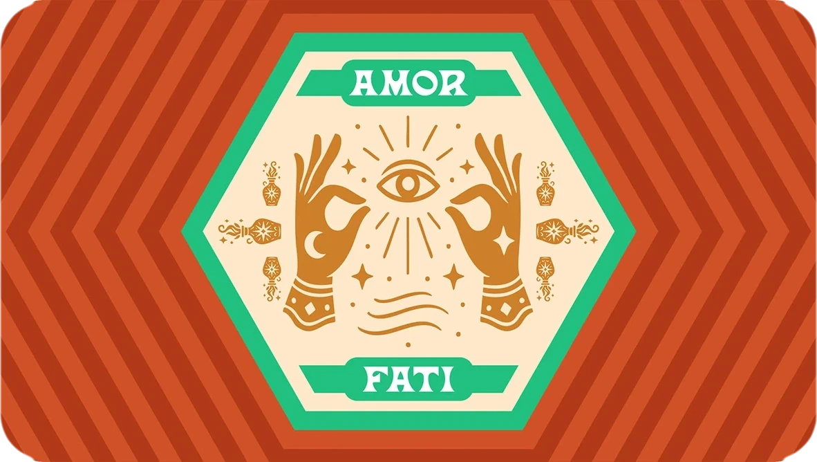
Amor fati means embracing the hand you have been dealt. Here, that idea connects the recipe proposition with a world in which familiar ingredients can become something unexpected.

Foodable / Amor Fati illustrated composition.
The product proposition, purpose and personality in one line

Play the ingredients
you’ve been dealt.

01

Magical

Make transformation visible.

02

Abundance

See possibility in what is available.

03

Connection

Food as a shared experience.

04

Rich culture

Bring ornament, stories and flavour into the world.

The Divine Stir / core symbol

A kitchen tool,
with another dimension.

A spoon is familiar and useful. Wings, a star and botanical detail give it an imaginative quality. The presentation develops that language into a symbol, related compositions and a fuller family of marks.

The Divine Stir / the original title composition for Foodable’s primary symbol.
Foodable / original winged spoon and star primary emblem.
Symbol vocabulary / spoon, wings, star and botanical ornament.
Food / Able / the spoon within a split typographic composition.
Foodable / crossed-spoon secondary composition.
Wordmark & logo family

Expressive enough
to have a voice.

The flowing Foodable wordmark provides a different pace from the emblem. It works alone, in a lock-up and in illustrated compositions, giving the system different degrees of formality and richness.

Foodable / original expressive script wordmark.
Wordmark detail / cropped and outlined lettering composition.
Foodable / the emblem and wordmark brought together in a vertical lock-up.
Foodable / ornamental wordmark composition.
Foodable food-stamp submark / solid frame.
Foodable food-stamp submark / outlined frame.
Typography & colour

Character in the headline.
Clarity in the details.

Las Cruces gives display text a distinctive, expressive voice. Cabinet Grotesk supports reading and information. The purple-led palette is extended by cream, orange, gold and a supporting green, with light and dark variants documented in the system.

Typography / Las Cruces, Foodable’s primary display typeface.
Typography / Cabinet Grotesk, the supporting typeface.
Typography in use / Turn leftovers into legends.
Foodable / original primary, lighter and darker colour palettes.
Colour and graphic composition / Amor Fati.
Illustration & cultural expression

Make the
possibility visible.

The chef characters are active participants in the world: cooking, learning and conjuring. Glowing ingredients, food, botanical ornament and theatrical gestures turn the strategic idea into something someone can recognise immediately.

Foodable / illustrated chefs with food, books, ornament and the winged-spoon motif.
Foodable / cooking and conjuring as related illustration directions.
Foodable / chef, cards, ingredients and a glowing spoon.
Foodable / the full ornamental identity composition.
Brand guidance & product connection

Keep the character.
Make it usable.

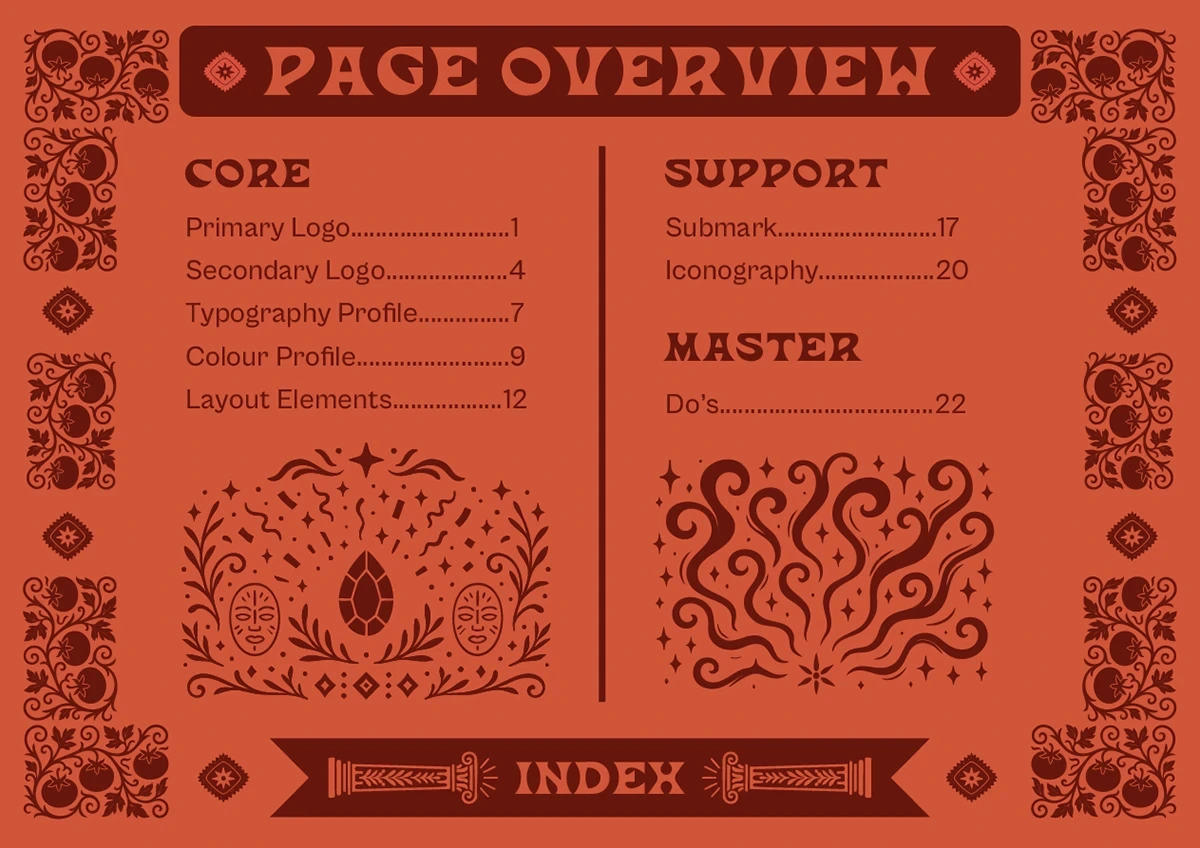
The identity is supported by a separate brand book covering logo behaviour, typography, colour, layout and iconography. A portfolio demonstration below explores the ingredient-led product proposition; it is distinct from the original visual identity artwork.

Try the idea / Interactive portfolio reconstruction

A useful premise.
A tangible interaction.

Select ingredients you have.
See how the recipe matches change.

What’s in
your kitchen?

Pick a few ingredients.
Let’s make a little into a lot.

Your possibilities

Pick ingredients to discover your matches.

A demonstration created for this portfolio, not the production Foodable app. Recipes and matching logic are illustrative.

Behind the work

How it was made.

Duration
16 weeks
Methodology
Iterative waterfall with weekly founder check-ins
Tools
  • Adobe Photoshop
  • Adobe Illustrator
  • Adobe After Effects
  • Figma
  • Adobe Firefly
  • GPT Image 2.5 Sunburst
  • Nano Banana Pro
  • Kling
  • Topaz Labs
  • Pinterest
Workflow
  1. Internal discovery workshop with the founders
  2. Internal insights, distilled
  3. Primary and secondary research
  4. Comparative analysis of the market
  5. Super-heavyweight brand strategy
  6. Positive and negative creative direction
  7. Visual and motion direction
  8. Identity: core, then support system
  9. Brand in action: real-world applications
  10. Project presentation
The thread through the work

Make resourcefulness feel full of possibility.

The published identity connects cooking with imagination and amor fati: working with the hand you have been dealt. Its winged spoon, star, ornament and illustrated chefs give that idea a recognisable vocabulary. The script wordmark adds movement; Las Cruces and Cabinet Grotesk give display and supporting information different jobs.

Through the Multidisciplinary lensBrand strategy, identity, illustration direction and a practical guide brought together around resourcefulness.

Original identity and guide artwork from the supplied Behance presentations. The ingredient-matching interaction is a separate portfolio demonstration.

View the identity on Behance
Next project

Range Sounds

A music identity that lives beyond the stage.
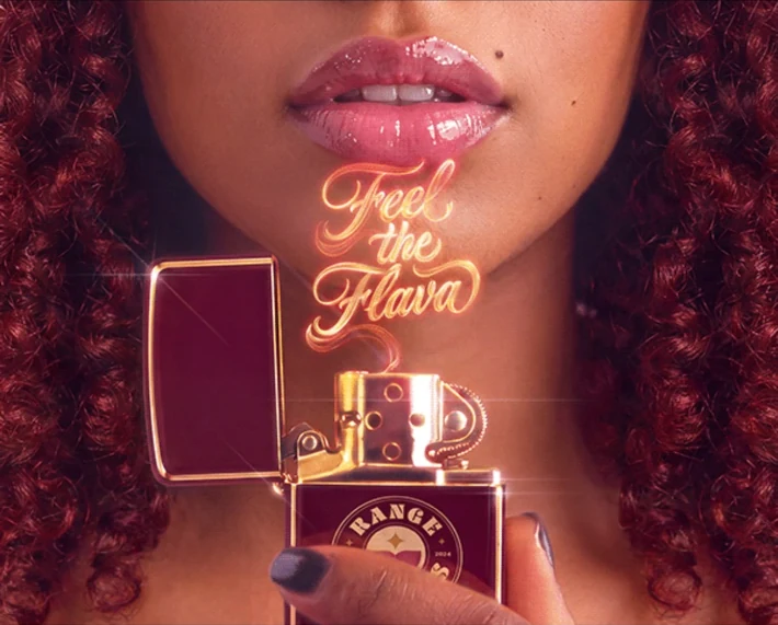
Range Sounds burgundy and gold lighter held beneath glowing Feel the Flava lettering, framed by a close-up portrait
Got something bold in the works?

Let’s make it
impossible to ignore.

Building a team, a brand or something that doesn’t fit in one box? Tell me about it. I’d love to hear what you’re making.
Back to top