Magical
Make transformation visible.
Play the ingredients you’ve been dealt.
A small band of friends fresh out of a London university, with a recipe app, a jar of jollof sauce and a lot of nerve. Their rivals? Recipe giants with millions in the bank, in an app store drowning in AI clones. They had belief and imagination. They needed a brand that looked ready long before they were big. That’s where I came in.
No track record, no famous name, and a software brand about to launch a physical sauce. To win supermarket buyers and stand out among AI recipe apps, Foodable had to look credible from day one.
Foodable starts with a practical question: what can I make with the ingredients and equipment I already have? The identity gives that everyday act of resourcefulness a world of its own—part culinary imagination, part cultural celebration.
Foodable’s practical starting point is the kitchen someone already has. The creative direction turns that constraint into a source of possibility: imagination, abundance, connection and rich food culture.
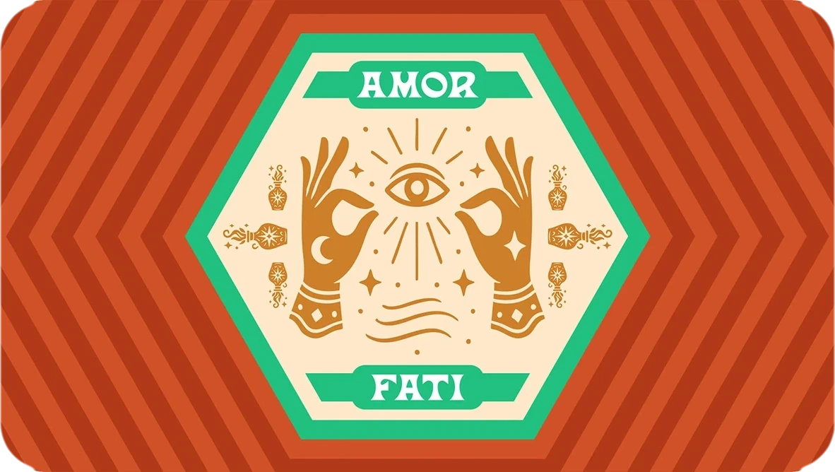
Amor fati means embracing the hand you have been dealt. Here, that idea connects the recipe proposition with a world in which familiar ingredients can become something unexpected.
Play the ingredients
you’ve been dealt.
Make transformation visible.
See possibility in what is available.
Food as a shared experience.
Bring ornament, stories and flavour into the world.
A spoon is familiar and useful. Wings, a star and botanical detail give it an imaginative quality. The presentation develops that language into a symbol, related compositions and a fuller family of marks.
The flowing Foodable wordmark provides a different pace from the emblem. It works alone, in a lock-up and in illustrated compositions, giving the system different degrees of formality and richness.
Las Cruces gives display text a distinctive, expressive voice. Cabinet Grotesk supports reading and information. The purple-led palette is extended by cream, orange, gold and a supporting green, with light and dark variants documented in the system.
The chef characters are active participants in the world: cooking, learning and conjuring. Glowing ingredients, food, botanical ornament and theatrical gestures turn the strategic idea into something someone can recognise immediately.
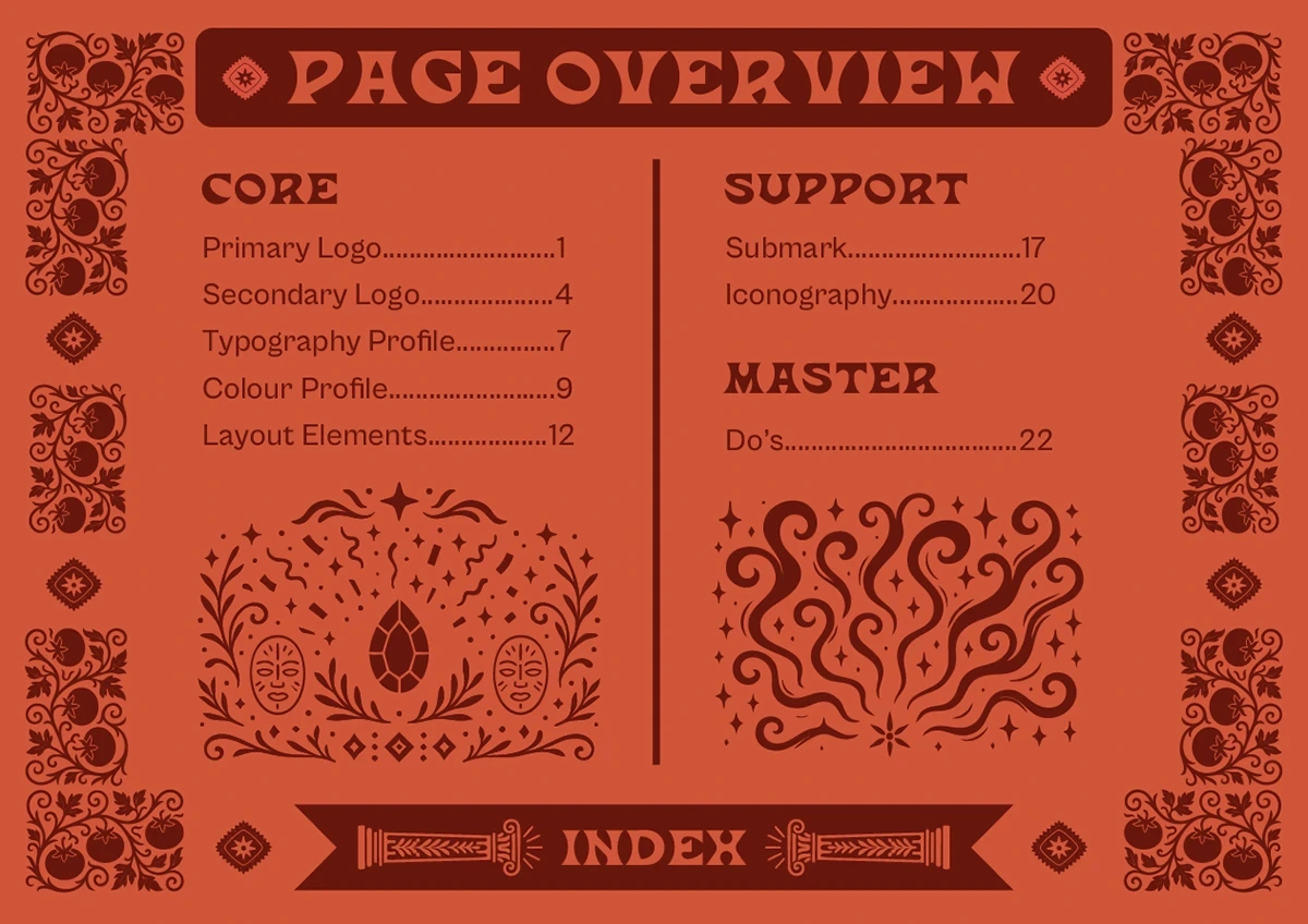
The identity is supported by a separate brand book covering logo behaviour, typography, colour, layout and iconography. A portfolio demonstration below explores the ingredient-led product proposition; it is distinct from the original visual identity artwork.
Select ingredients you have.
See how the recipe matches change.
Pick a few ingredients.
Let’s make a little into a lot.
Pick ingredients to discover your matches.
A demonstration created for this portfolio, not the production Foodable app. Recipes and matching logic are illustrative.
The published identity connects cooking with imagination and amor fati: working with the hand you have been dealt. Its winged spoon, star, ornament and illustrated chefs give that idea a recognisable vocabulary. The script wordmark adds movement; Las Cruces and Cabinet Grotesk give display and supporting information different jobs.
Through the Multidisciplinary lensBrand strategy, identity, illustration direction and a practical guide brought together around resourcefulness.
Original identity and guide artwork from the supplied Behance presentations. The ingredient-matching interaction is a separate portfolio demonstration.
A music identity that lives beyond the stage.
Building a team, a brand or something that doesn’t fit in one box? Tell me about it. I’d love to hear what you’re making.