Range Sounds
Life is a soundtrack. Come hear yours.
It started with one DJ and a loose underground R&B night. Word spread. London’s twenty-somethings kept coming back, packing every room. The brand had to catch up with the crowd, and turn a party into a name people queue for. That was my job.
What changed.
- From underground party to a recognisable London cult brand
- Festival-grade look that raised ticket value and prestige
- Social assets designed to turn Instagram views into tickets
- Built to scale into bigger venues and set designs
A buzzing night with no visual identity looked like every other flyer in the feed. Momentum lived and died on word of mouth, and every promo had to start from scratch.
- Internal discovery workshop with the founder
- Internal insights, distilled
- Primary and secondary research
- Comparative analysis of the scene
- Lightweight brand strategy
- Positive creative direction
- Visual direction
- Identity: core, then support system
- Brand in action: real-world applications
- Project presentation
On the street. In your hands. Around the music.
Feel the Flavour.
Range Sounds brings music into the places people gather, the objects they keep and the routines they enjoy. The current presentation explores that world through nightlife, listening culture, campaigns and everyday objects.
- Client / Brand
- Range Sounds — an entertainment and media company.
- Solution
- A more distinctive, coherent brand presence across music, culture and shared experiences. Positioning, memorability and trust were the stated aims.
- Services
- Brand strategy & positioning
- Visual identity & creative direction
- Brand applications
- Digital & campaign art direction
Credits Gavin Roy Nkalubo +
- Brand strategy & creative direction
- Gavin Roy Nkalubo
- Brand identity & visual/UI design
- Gavin Roy Nkalubo
- Copywriting & motion design
- Gavin Roy Nkalubo
- Brand photography / videography
- Gavin Roy Nkalubo
- Production design & project management
- Gavin Roy Nkalubo
A soundtrack
for the city.
The identity is put to work at very different distances: a billboard across a square, a passing bus, a record-shop frontage. Scale changes; the warmth, lettering and music-led attitude remain recognisable.
A moment
in someone’s day.
A close portrait and a short line carry the campaign into the commute. The visual changes with the setting, while the cream brand block keeps the signature clear.
The room
is part of the brand.
Arrival, lighting, wristbands and the stage all contribute to how an event feels. These visualisations explore the identity as an experience that surrounds people, rather than a logo added at the end.
Good music.
Good people.
Good vibes.
One recognisable world.
Many ways to enter it.
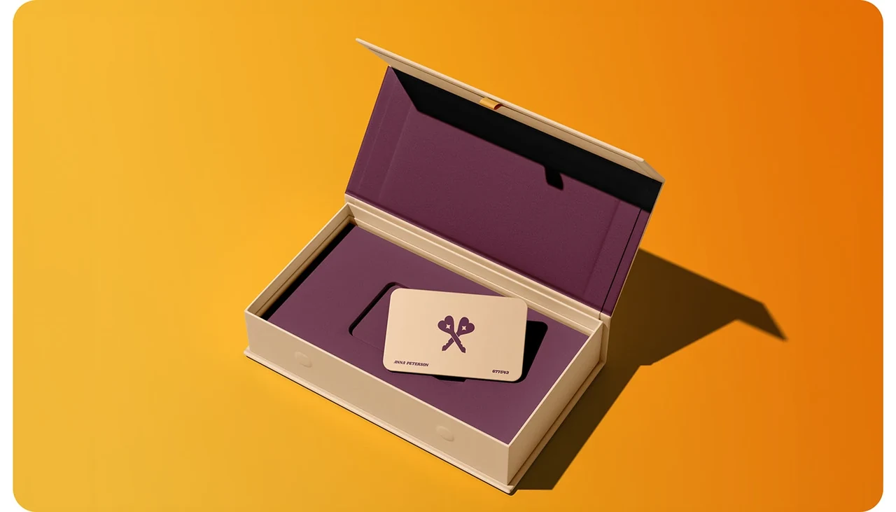
The circular seal, expressive lettering, warm palette and curled silhouette recur throughout the presentation. The identity is examined through the things it makes possible: a record poster, a paper edge, a keyring or a space to listen.
Colour sets the atmosphere.
Burgundy and cream form the core, with pink and gold appearing through the supplied applications. These are the colours used by this presentation; individual artwork retains its original palette.
Burgundy / #601B30The edge
becomes an asset.
The silhouette travels from illustration into the cut of the stationery. It gives even a plain sheet or notebook a recognisable physical character.
Objects with
a place in your life.
The applications move between music equipment, keepsakes and domestic settings. Recognition comes from the relationship between colour, shape, material and atmosphere, rather than putting the same lock-up in the same place every time.
Life is a soundtrack.
Come find yours.
The same world can be nostalgic, tactile and playful. The retro-phone application gives the verbal identity a familiar object to live in.
From a listening spot
to a working space.
The brand world extends into discovery, shared work and interiors. Each setting uses different surfaces and objects, with the same colour relationships and recurring shapes tying them together.
Music, culture
and discovery.
The broadcast concept translates the same world into a stage-like screen composition: records, a portrait motif, colour, equipment and a clear brand signature.
Feel the
Flavour.
How it was made.
- Duration
- 6 weeks
- Methodology
- Iterative waterfall
- Tools
- Adobe Photoshop
- Adobe Illustrator
- Adobe After Effects
- Figma
- Adobe Firefly
- GPT Image 2.5 Sunburst
- Nano Banana Pro
- Kling
- Topaz Labs
- Workflow
- Internal discovery workshop with the founder
- Internal insights, distilled
- Primary and secondary research
- Comparative analysis of the scene
- Lightweight brand strategy
- Positive creative direction
- Visual direction
- Identity: core, then support system
- Brand in action: real-world applications
- Project presentation
The identity travels through shape, colour and atmosphere.
Burgundy, cream, pink and gold recur across the applications, while expressive lettering and the circular seal establish recognition. The curled silhouette becomes more than ornament: it shapes stationery, cushions and the floating tray. Together, those details connect very different scenes without asking each one to look identical.
Through the Multidisciplinary lensStrategy, identity, campaign art direction and physical applications within one recognisable world.
Selected application visualisations from the supplied 2026 presentation. Brand credits follow that presentation. Depicted products, venues, placements and partnerships are concepts unless separately confirmed as delivered work.
Sweet Escape
A cupcake café identity, carried from street to takeaway.
Building a team, a brand or something that doesn’t fit in one box? Tell me about it. I’d love to hear what you’re making.