FoodableBrand Style Guide
Keep the magic. Give it a method.
An expressive brand is easy to love and easy to break. As Foodable grew, its magic had to be written down, so a small team could keep every new asset on-brand without a designer in the room. So I wrote the rulebook.
What changed.
- Eliminated asset-creation bottlenecks for future product extensions
- Dynamic typefaces and custom patterns, ready to use
- Every asset consistent as the business scales
Every new asset risked diluting a richly expressive identity. Without clear rules, growth would have meant inconsistency.
- Audit of every brand asset
- Rules for logo, type, colour and layout
- Dynamic typefaces and custom patterns
- Iconography and submarks
- Seven master rules
- Full brand book presentation
Start at the beginning.
Keep the magic. Give it a method.
An identity needs to remain recognisable in someone else’s hands. This guide translates Foodable’s expressive visual world into repeatable decisions, while leaving room for character.
- Client / Brand
- Foodable — an ingredient-led recipe app.
- Solution
- A practical guide to the Foodable identity: logo behaviour, colour relationships, typography, graphic devices and iconography.
- Services
- Brand guidelines
- Identity system documentation
- Editorial & information design
Credits Gavin Roy Nkalubo +
- Brand strategy & creative direction
- Gavin Roy Nkalubo
- Visual identity & brand guidelines
- Gavin Roy Nkalubo
An expressive identity.
A practical handbook.
The guide opens by explaining how to keep Foodable consistent, clear and full of character. The complete original sequence follows, organised into its actual chapters so the details remain easy to explore.
Consistency
without losing the soul.
The introduction positions the book as a practical way to use the brand confidently: across marketing, websites, packaging and other creative work.
Recognition
starts here.
The symbol and wordmark are documented separately. Each has a display page, clear-space instruction and minimum-size guidance for digital and physical use.
Expression
and hierarchy.
The guide names Las Cruces and Cabinet Grotesk, then shows how display, headings, subheadings and body text relate. The original scale and usage page is retained so the hierarchy can be inspected.
The palette,
in relationship.
The colour chapter goes beyond a row of swatches: it shows the main, light and dark palettes, example combinations and an applied composition.
A vocabulary
for building compositions.
Fillers, containers, frames, illustrations, pointers and dividers turn the identity into a usable layout system. Their different roles help the next person making the work choose deliberately.
The smaller details
still belong to the world.
The food-stamp submark receives the same display, spacing and sizing treatment as the core marks. The iconography chapter then connects the illustrated forms to practical interface roles.
Keep the craft
in the handover.
The final page sets out the seven master rules: original vector assets, even scaling, approved colours, deliberate placement, purposeful use, breathing space and attention to the viewer.
Return to the Foodable visual identity
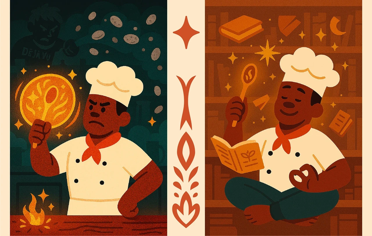
How it was made.
- Duration
- 3 weeks
- Methodology
- Iterative waterfall
- Tools
- Adobe Photoshop
- Adobe Illustrator
- Adobe After Effects
- Figma
- Adobe Firefly
- GPT Image 2.5 Sunburst
- Nano Banana Pro
- Kling
- Topaz Labs
- Workflow
- Audit of every brand asset
- Rules for logo, type, colour and layout
- Dynamic typefaces and custom patterns
- Iconography and submarks
- Seven master rules
- Full brand book presentation
Different elements. Deliberate roles.
The winged spoon anchors recognition. Las Cruces provides display character, while Cabinet Grotesk supports the information. Colour, ornamental frames and icons extend the system without making every surface behave the same way.
Through the Multidisciplinary lensAn identity translated into useful guidance across typography, colour, layout and supporting assets.
The complete original 25-page published Foodable Brand Book & Style Guide presentation, including the cover, introduction, index and 22 numbered guide pages. This is a separate deliverable from the visual identity project.
Foodable
A recipe brand built around the possibilities already in your kitchen.
Building a team, a brand or something that doesn’t fit in one box? Tell me about it. I’d love to hear what you’re making.