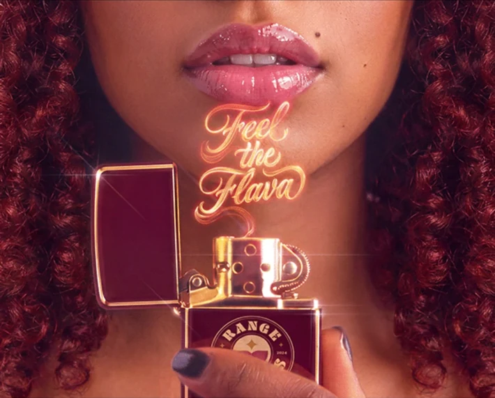
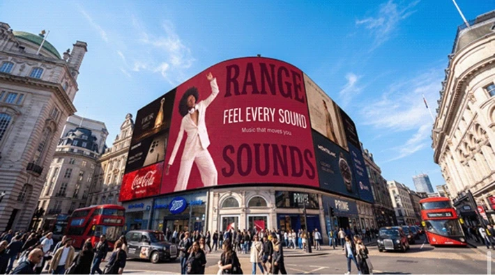
It’s tempting to judge an identity by its logo on a white page. That is rarely where people meet a brand. They meet it across a square on a billboard, on the side of a passing bus, on a wristband at the door, on a notebook in someone’s bag.
Range Sounds is a music identity that lives beyond the stage. Music brings people together in places, so the identity had to work in places too: on the street, in the commute, at an event and at home.
So the question I kept asking wasn’t “does the logo look good?” but “would you still recognise this if the logo wasn’t there?” The answer came from relationships rather than repetition: burgundy and cream at the core, pink and gold appearing through the applications, a circular seal, expressive lettering and a curled silhouette that recurs throughout.
Recognition comes from the relationship between colour, shape, material and atmosphere, not from putting the same lock-up in the same place every time.
The silhouette is a good example. It starts in illustration, then travels into the cut edge of the stationery. Even a plain sheet of paper gains a recognisable physical character. Nothing is shouting the name, and yet it couldn’t belong to anyone else.
Building a world also gives a brand room to change its mood. The same Range Sounds world can be nostalgic, tactile or playful; a retro phone becomes a place for the verbal identity to live. The system holds while the expression adapts to the setting.
That is what I look for in identity work: a set of relationships strong enough to travel, so the brand is felt in the room before anyone reads the name.