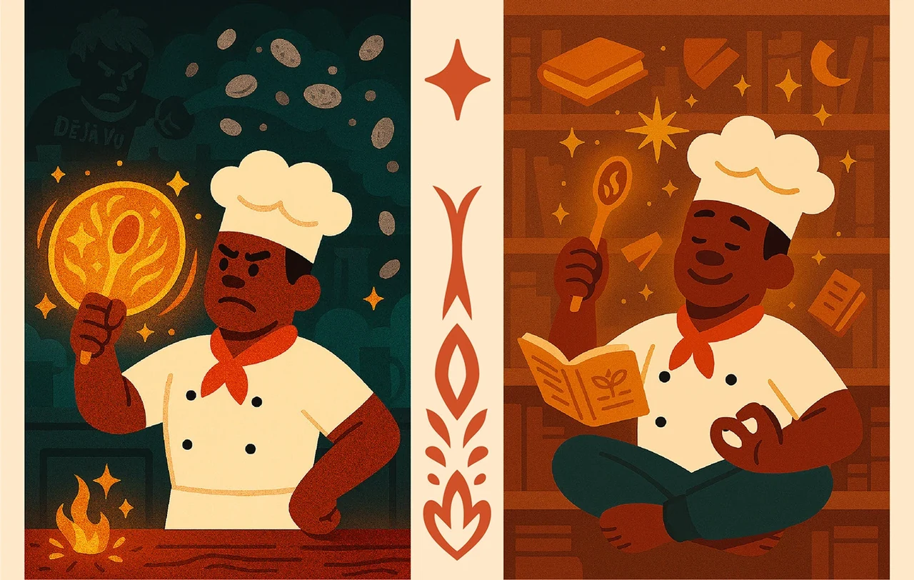
Foodable’s practical starting point is simple: the kitchen someone already has. Not a fantasy pantry or a list of ingredients bought for one recipe, but the cupboard, the fridge and the leftovers that are already there.
On paper, that sounds like a limitation. It became the idea. Amor fati means embracing the hand you have been dealt, and it connects the recipe proposition with a world in which familiar ingredients can become something unexpected.
Once the idea was clear, the creative direction could do its job. It turns the constraint into possibility through four qualities: magical, abundance, connection and rich culture. Each of those words then had to show up somewhere you could see it.
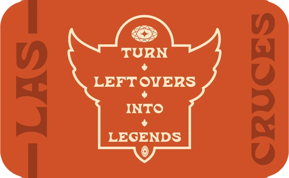
A spoon is familiar and useful. Wings, a star and botanical detail give it an imaginative quality. The chef characters cook, learn and conjure; ingredients glow. “Turn leftovers into legends” says the same thing in words.
The strategy shouldn’t stay in a deck. It should become something you can recognise immediately.
This is the thread I care about most in multidisciplinary work. The positioning should inform the story, the identity and the experience. When it does, visual decisions stop being decoration and start doing strategic work.
And when an idea is that expressive, the system has to be written down so it survives contact with other people. That is why Foodable also has a brand book covering logo behaviour, typography, colour, layout and iconography, so the next person making the work can choose deliberately.