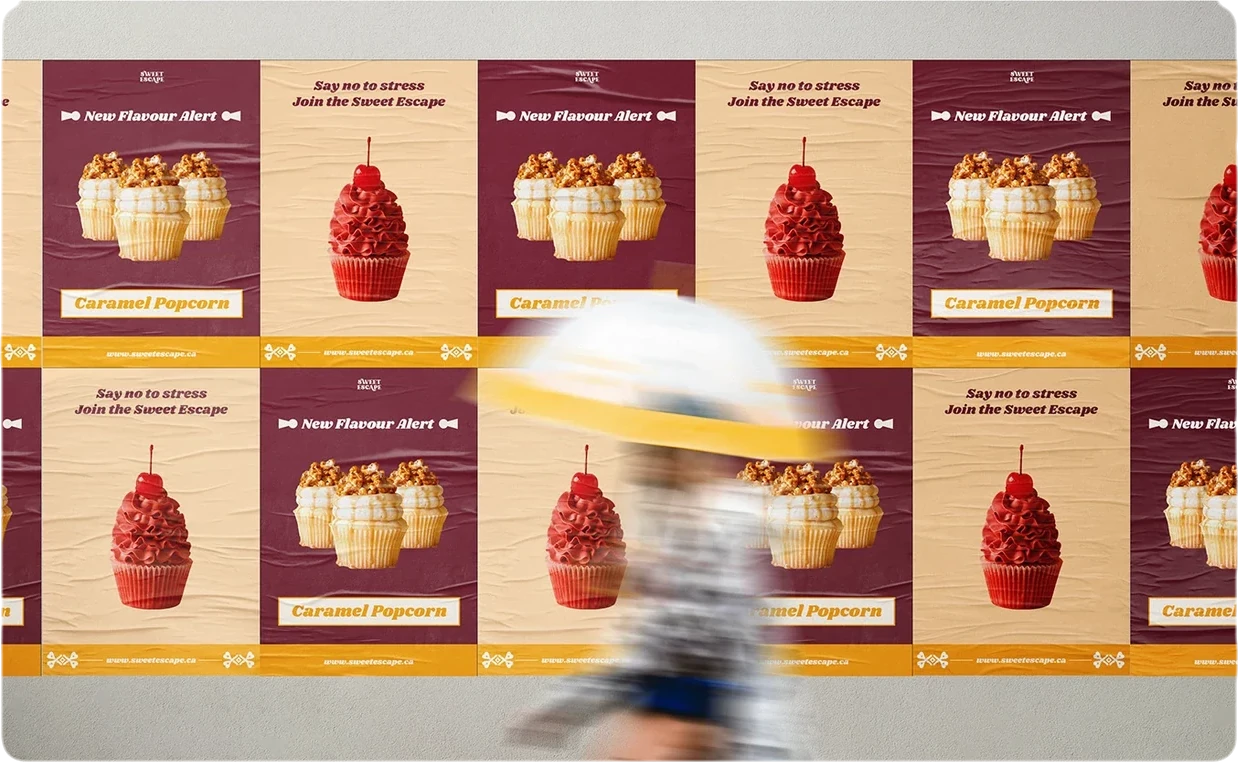
Sweet Escape is one of my passion projects: a café identity. I wanted to explore a warmer, more expressive alternative to the original Toronto Cupcakes presentation, and I set the direction with four words: feminine, soothing, premium and whimsical.
Gentle brands can easily become vague. Soft colours, rounded type, a heart here and there: easy to make, hard to keep consistent. Softness only becomes an identity when there is structure underneath it.
The mark started from the name. Escape suggests opening a door, so crossed keys became the symbol; heart-shaped details soften it, and a bite connects it to something edible. A construction sheet then gives the idea a controlled, repeatable form. The meaning comes from the keys, hearts and bite; the geometry keeps it balanced.
Softness is a tone. A system is what makes it trustworthy.
The same thinking runs through the rest of the kit. Shrikhand brings rounded display character while Lato carries the information. Light peach and cream make space for a gentle expression, maroon adds depth and marigold brings warmth and emphasis. Keys, hearts, sparkles, the monogram and the characters become a family of devices rather than one-off decorations.
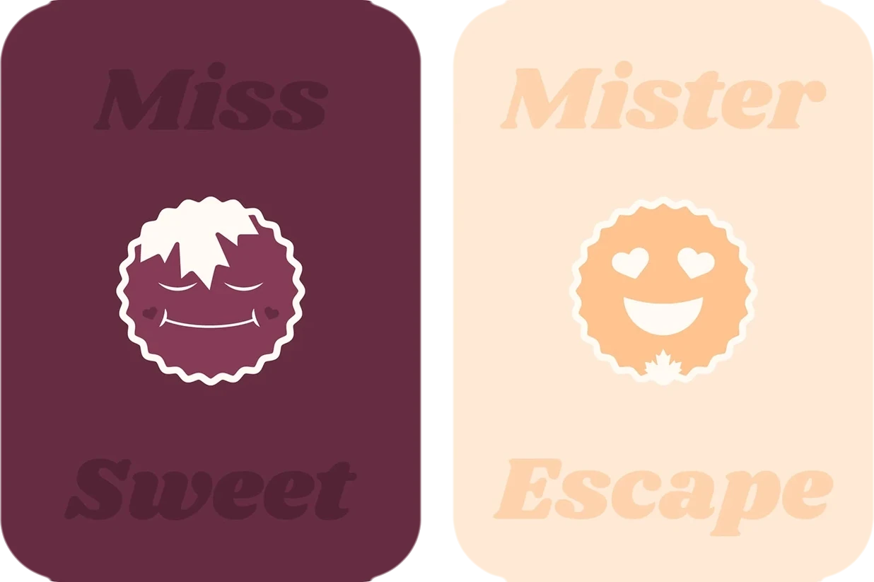
That family is what lets the brand move: from campaign posters to boxes, cups and a carrier, from signs and uniforms to a mobile menu where navigation and availability stay the practical focus. Each piece can be playful because the system underneath is doing the work.